
How to Design a Church Flyer That Gets Noticed (and Read)
Churches design flyers and leaflets more often than most organisations—seasonal services, community events, ministry launches, and outreach projects all need simple, effective tools to help spread the word.
And when they’re done well, a strong church flyer design can be used far beyond the noticeboard. One strong design can serve as a base for:
A printed leaflet at your welcome table
A poster for your community café window
A social media post or story
A WhatsApp-forwarded invite and more.
That’s why getting the design right matters. A clear, warm, and inviting flyer helps your message land, get shared, and inspire action.
Key Layout Tips for Church Flyer & Leaflet Design
A well-laid-out flyer is easy to read, easy to remember, and easy to act on. Here’s how to do it:
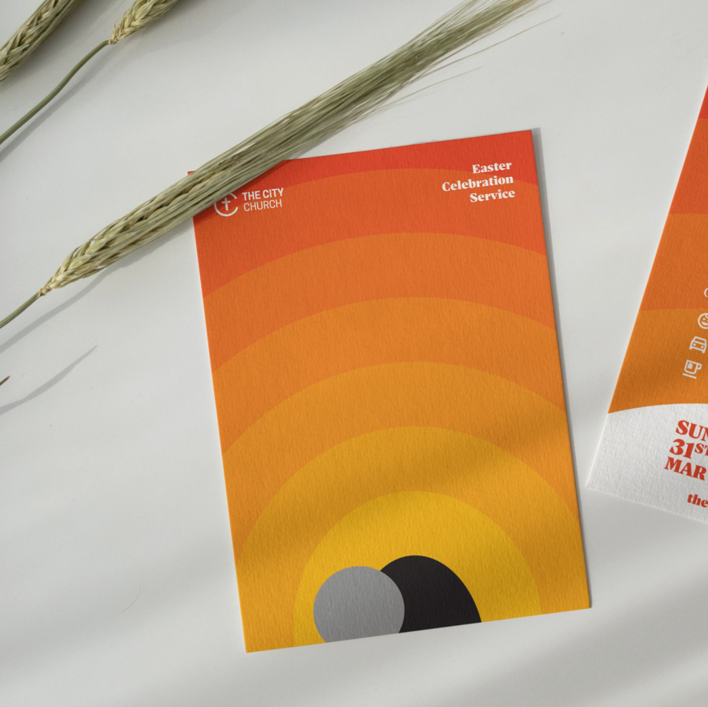
1. Top Section: Headline + Visual Impact
Use a short, bold headline that sets the tone
“Alpha Starts Here.”
“Carols by Candlelight.”
“Need Hope? Let’s Talk.”
Visual Tip:
Include one large central image that reflects the mood or theme
Real is better than perfect— if you don’t have a designer in house, use photos of your own church and community where possible. People connect more deeply with familiar, honest images than they do with polished stock photography.
2. Middle Section: The Core Info
Keep this clear and skimmable.
What is it? (Event name or service type)
Where? (Venue name + postcode)
When? (Date + time)
Who’s it for? (Families? Youth? Newcomers?)
Anything else they need to know?
Use icons or columns to break up info and make scanning easier.
3. Bottom Section: Call to Action + Contact Info
What do you want someone to do after reading?
Examples:
“Join us for free refreshments”
“Visit our website to RSVP”
“Text ALPHA to 07800 123456”
Also include:
Church logo
Contact method (phone/email/web)
A QR code if applicable
Design Tips for Church Flyers and Leaflets
✅ Keep it simple
One key message per flyer—resist the urge to include everything.
✅ Use church branding
Stick to your logo, fonts, and colours so people recognise your church.
✅ Use real photos
Photos of your own congregation create familiarity and trust. Stock photos might be easier, but they can feel cold or fake.
✅ Design for print and social
Think ahead: can this flyer become a social post? A slide for your screens? A story for Instagram?
Common Church Flyer Design Mistakes
🚫 Too much text
Cramming in every detail means no one remembers anything.
💡 Prioritise space. Less is more.
🚫 Low-res or overly polished photos
Poor-quality images or sterile stock photos weaken trust.
💡 Use real images, taken with care, at high resolution.
🚫 No clear CTA
If there’s no action step, people won’t know what to do next.
💡 Include a “next step”—visit, RSVP, show up.
🚫 Inconsistent design
Too many fonts or clashing colours confuse rather than connect. If your flyer looks completely different from your website, signage, or Sunday slides, it can feel disconnected—even if the message is good.
💡 Stick to two fonts max, a harmonious palette, and stay consistent with your wider church brand. If you haven’t defined your branding yet, our guide on Why Your Church Brand Matters More Than You Think (And How to Get It Right) can help.
Free Tools for Church Flyer Design
🧰 Canva – Great for easy, editable templates (free and paid)
🧰 PosterMyWall – Drag-and-drop flyer builder with church-specific options
🧰 Unsplash / Pexels – Free high-quality photos (use sparingly, and supplement with your own)
🧰 QR Code Generator – Turn any web link into a scannable code for your flyer
Need a Hand with Your Next Church Flyer?
At Flock and Canvas, we help churches across the UK design flyers and leaflets that are clear, on-brand, and easy to reuse across formats. From editable templates to full design support, we can help you put your message in more hands.